The clean sleek look of the all-white monochromatic kitchens used to be everywhere in kitchen design praised for its simplicity and serene look. However, home décor magazines focusing on interior design don’t account for the practicality and functionality of a kitchen where food is prepared, messes occur or even small items with nutrition labels will not match the aesthetic.
In the most recent Kitchen and Bath Industry Show 2019 at the Las Vegas Convention Center, color and wood grain paneling on kitchen cabinets are everywhere, colorful backsplashes (link), and highly textured countertops are dominating the show booths.
But is minimalism out of vogue in kitchens today? Let’s take a look at booths this year at KBIS 2019 going for a clean aesthetic:
Table of Contents
Innocraft
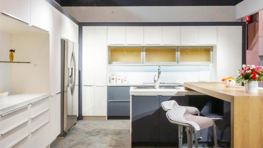
The booth at Innocraft was among the most minimalist designs this year at KBIS, sticking to contemporary model cabinets. The most popular cabinet design was this interesting take on the two-tone cabinet with a cream-colored light contrasting as the slate grey base cabinets. But in this design, they had a slate grey frame around the entire cabinet structure with the cabinet doors at the sides in the lighter colors so that it makes a clean-looking arch in the design.
Golden Home
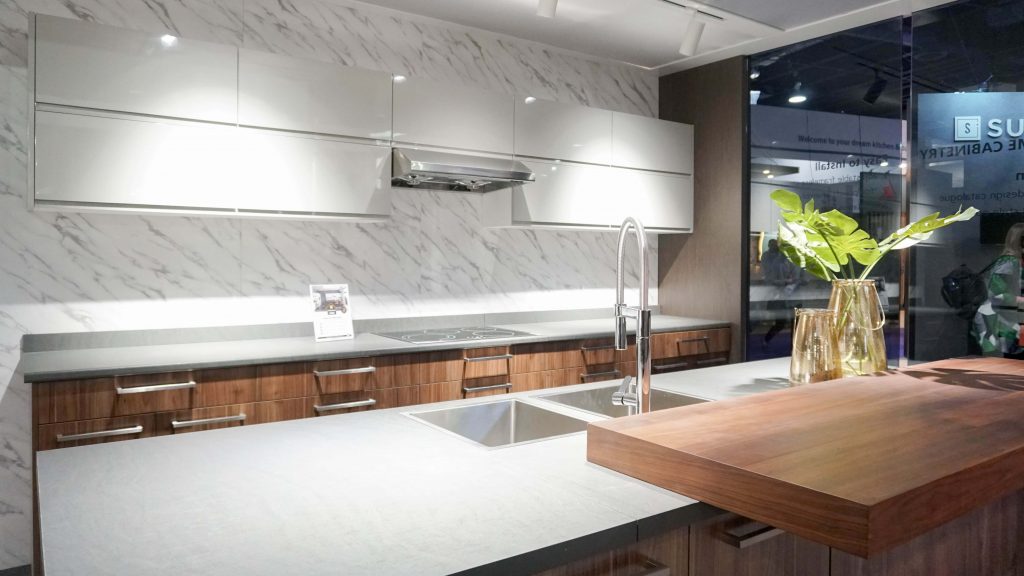
This booth at Golden Home has a modest marble print on its backsplash and wall and creating the two-tone cabinet in a different way, using a light grey handleless cabinet design on the upper cabinets and walnut grain lower drawers with silver handles. This kitchen model includes both colors of countertops with the walnut top laid on top of the light grey countertop. This consistent use of both colors throughout the keep the entire kitchen cohesive.
Winslyn
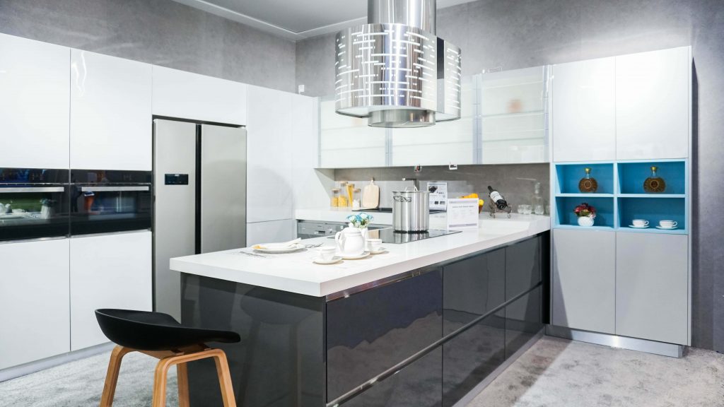
This booth at Winslyn Industries features automatic glass cabinets that raise like horizontal blinders when a touch sensor is activated at the bottom. Keep to technological simplicity, the rest of the cabinets are kept sleek without handles with the doors activated by pressing the corner to release the magnetic mechanism. Aside from appliances, the only other color is the dark grey lower cabinet full access drawers that disappear in the overall look, focusing the attention towards the tops of the kitchen.
Cabico
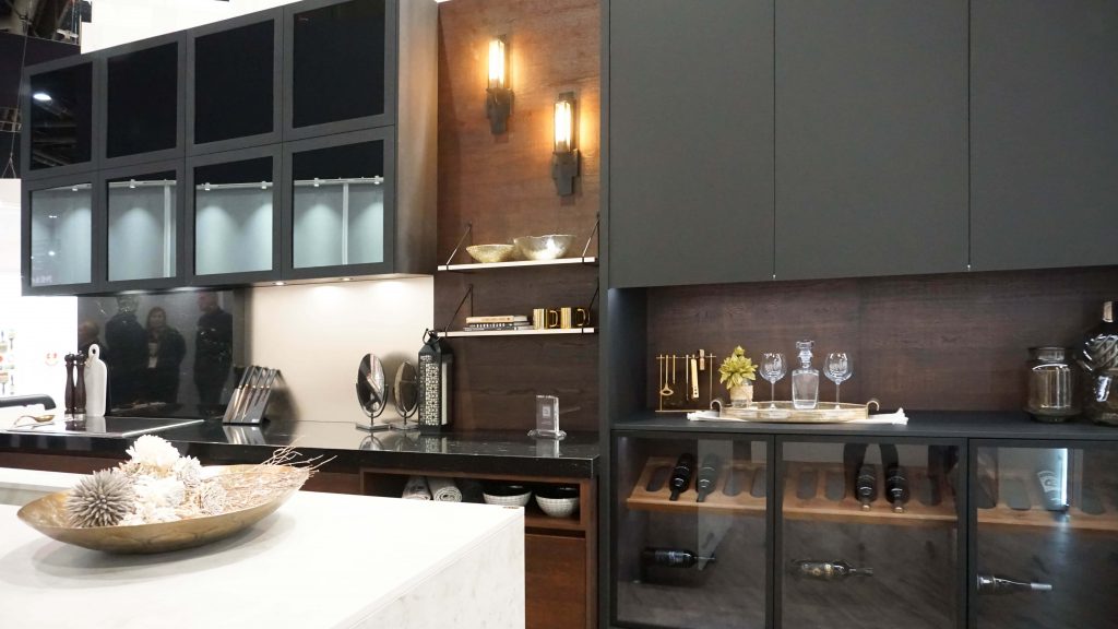
This booth at Cabico Custom Cabinet shows a very high end looking cabinet display while maintaining a clean aesthetic. This display uses very dark woods as the foundation color for the cabinets with a slightly lighter brown paneling for the background. The cabinet doors are augmented by square glass doors framed by the cabinet wood in the upper left section of the display and glass sliding doors where the wine is stored, making a two-tone with different materials: Wood and Glass.
Interni Cucine
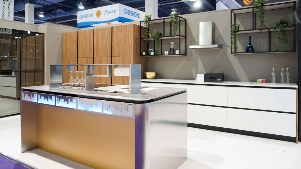
This booth at Interni Cucine (Italian for “Kitchen Interiors”) features a centerpiece countertop that not only has LED design work at the edge of cityscapes but has a panel that raises at the press of a button to reveal its own storage. In order to keep the attention to the central piece, the rest of the cabinet was kept sparse in neutral colors and woods. This kitchen display even included open cube shelving rather than cabinets, going even more minimal and playing with space.
Plato Woodwork
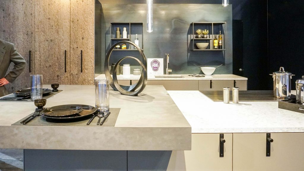
This booth at Plato Woodwork went further than the popular two-tone color cabinets that were in many places at KBIS: This kitchen design featured two different types of materials and surfaces. The ceiling-to-floor cabinets have doors with a highly textured bark surface and there were two different types of stone countertops with a matching set of base kitchen cabinet drawers. The metallic backdrop ties the whole kitchen together, making this a kitchen of natural surfaces and textures.
FX Cabinets
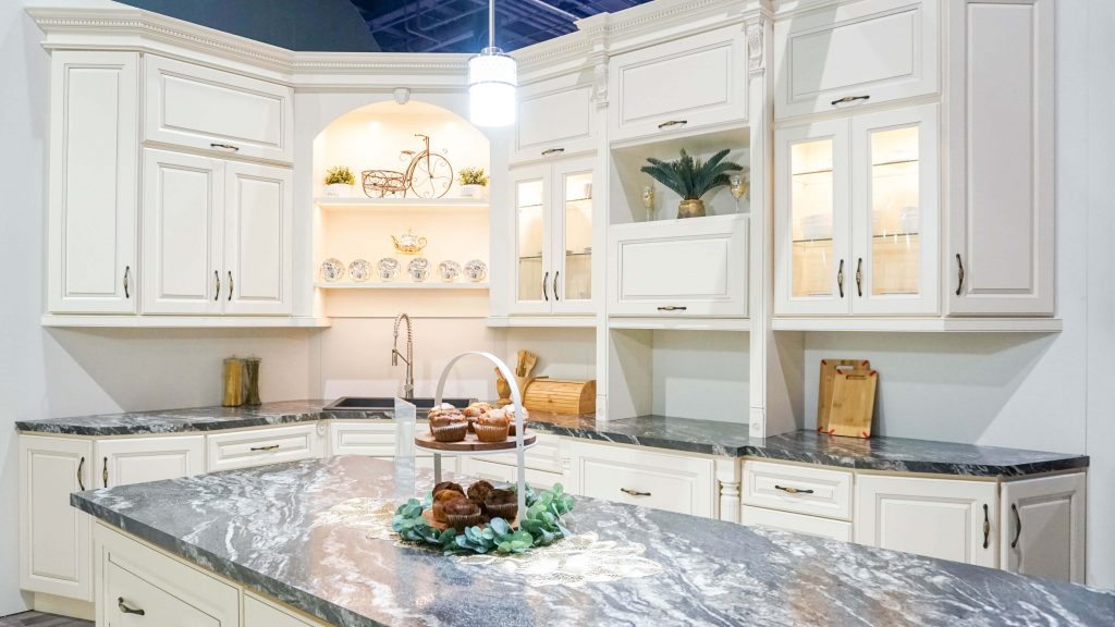
This booth at FX Cabinets has cabinet doors and drawers with a single uniform light yellow hue with raised panels. Upon closer inspection, the edges of each panel were dremeled to create a groove and look like a bold outline from a distance, making the edges stand out. This is matched by a dark heavily-patterned marble countertop where the pale sections of the marble are picked up by the surrounding color of the kitchen cabinet.
Wellborn
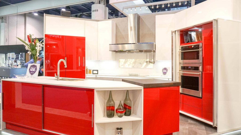
This booth at Wellborn Cabinets uses the popular two-tone cabinet style but goes for bold with bright cherry red cabinetry highlighting certain areas of the kitchen in contrast to the eggshell white for the rest of the cabinet. This is all matched with the silver tone of the appliances such as the oven, the fan exhaust over the stove and the kitchen sink. This entire kitchen looks like a perfect mix of contemporary and retro, looking like it was all inspired by a Classic Coca-Cola can!
Conclusion
There will always be a need for a clean style, whether people call it minimalist or not. People may disagree that the booths represented here represent any kind of minimalism, but we are clearly moving away from the monochrome look that has dominated most of the home décor last year. These booths show that minimalist kitchens do not mean boring kitchens and they may even be inspiring kitchens when it comes to choosing an aesthetic in your home that works for you!


