Choosing the right décor for an open floor plan
Gone are the days of partitions and sectioned off areas. ‘In’ are wide spaces, open plan living that promotes a breezy atmosphere and brings people together. The idea is based on an open floor plan that has been widely embraced in recent years. It’s a great room concept that combines the kitchen, dining room, and living room in a shared space. They are particularly effective in homes of less square footage. And, when it comes to color… well, the world can be an overwhelming palette of possibilities.
There’s no reason for a space to be mundane or plain in this day and age, much can be made of even the most minimalist room, its beauty borne of simplicity. But a lack of color is unnecessary in any scenario. Sure, too much color can be its own worst enemy, but that’s where the trick is – to find the balance. If you are able, you find the key to an artful room, the elegance of which may not be denied.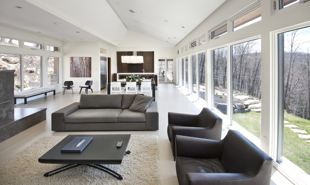
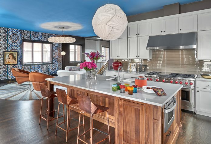
Always be mindful that a neutral backdrop is a particularly effective starting point. And it doesn’t have to be entirely monochromatic, even when working with muted colors. A white theme is a classic, you can’t go wrong with it in the kitchen, dining space, or the family and living rooms – it works well with contrasting styles. But you may not want to use color additions to pique interest. For that, try wallpaper, textured walls or contrasting hues instead – you may prefer the results. They are all reliably eye-catching. If it’s an interesting and original variation that you’re looking for, you have no shortage of options. With a unifying backdrop (such as one in white) varying styles like contemporary and eclectic may be mixed without clashing.
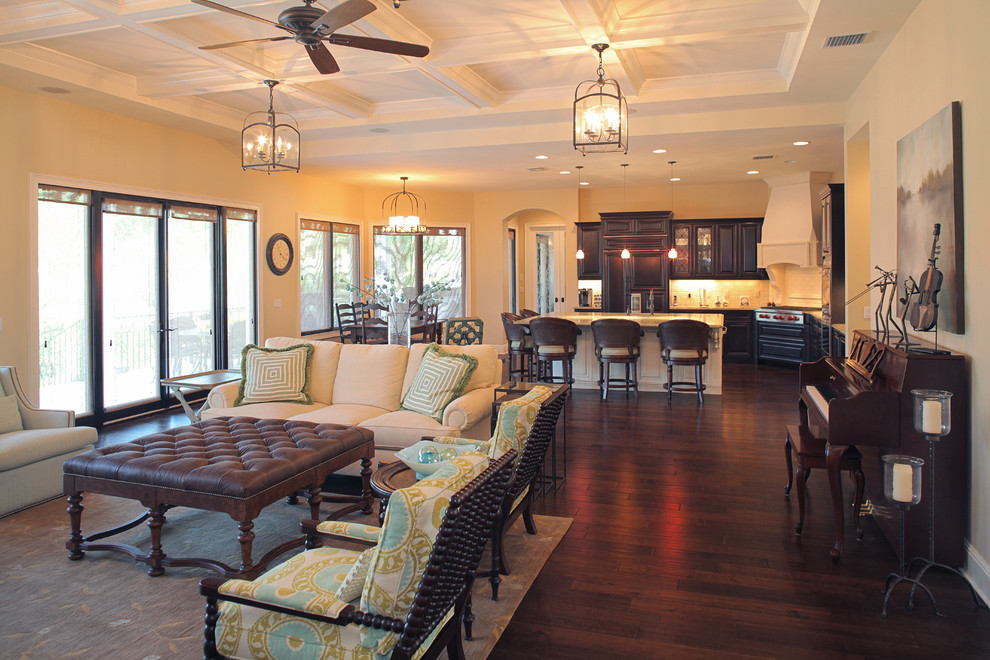
If an all-encompassing backdrop doesn’t appeal to you, the ‘shade on tone’ approach might. With it, the open plan background is hardly absent but it is offset with graceful and elegant contrast. As you move within the living area, so too do the tones shift, from light to dark or however arranged. Throw in a dramatic pop of color at one point for a subtly impressive result. A little ingenuity and a tasteful sense can make it work.
Just as writers often use a thesaurus (guilty!) even those of us with an excellent eye may still benefit from the use of a color wheel. You can overhaul the floor plan completely by narrowing your favorite corresponding colors and choosing a group of three. Such triadic colors are indicated by the wheel, using the equidistant triangle feature to pinpoint color harmonies. It may seem intimidating, but it’s really very easy to use, and it will surely help you pick a tasteful and refined color grouping that doesn’t scream out in pain.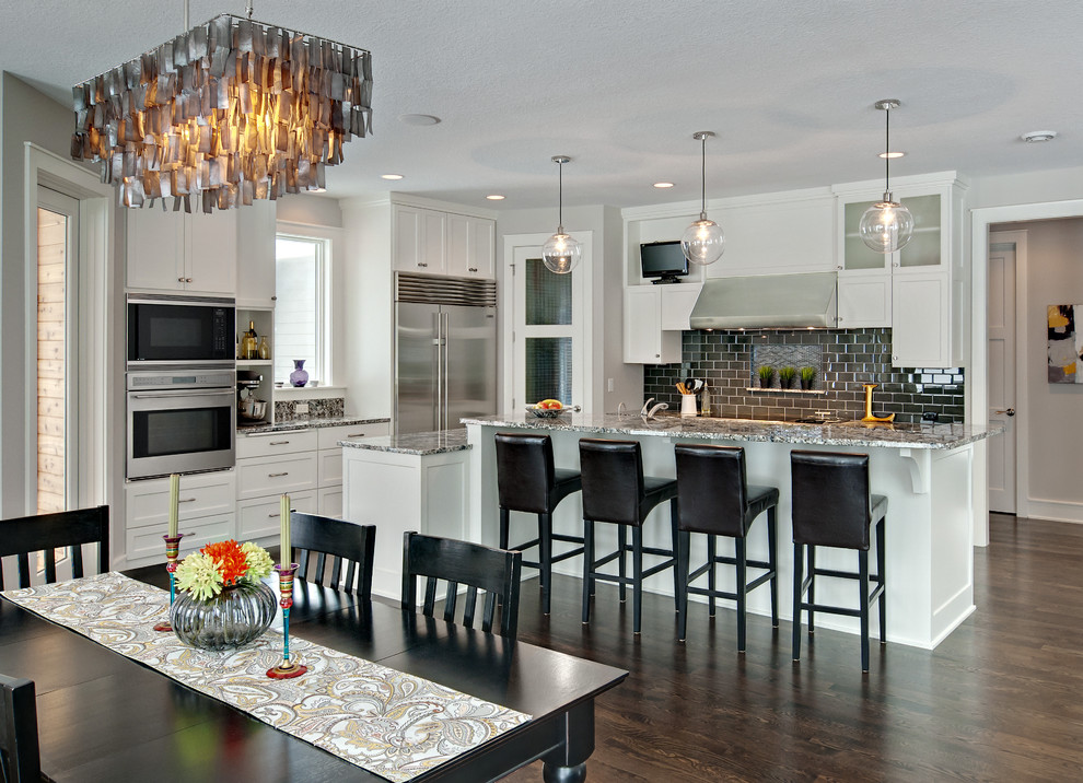
You can also use color to outline specific areas and connect random spaces. You may want to think in terms of unification. For instance, kitchen cabinets that are of the same hue as the walls of the living area could match a similarly colored dining space, thanks to bright pendant lighting. As a whole, such combinations create a glorious flowing theme that even embrace the sections that otherwise appear to be separate. On the other hand you may want to do the exact opposite by allowing each area its individuality (often via an accent hue) but keep the backdrop consistent. This approach will help identify the separate rooms.
The open floor plan can also benefit profoundly from the use of accent décor and related accessories (such as statues or art on the walls), embellishments that have gained popularity thanks to their easy chemistry with the open floor plan. Knick-knacks, pillows, even fixtures as large as a couch can lend a complementary or even bold statement to the living area without being disruptive to the established theme. For the kitchen, displayed decorative china is a popular source for a bright accent, and a fancy large table in the dining area while an impressive work of art hangs on the wall is also a wise choice. Of course you can mix and match and have a lot of fun with the changing seasons and holidays!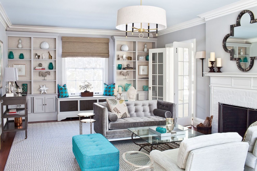
If you don’t want the light and airy feeling that typically comes with a large open floor plan you can incorporate darker hues that can serve as a visual anchor. Commonly, white and lighter tones are used more than others but you can weigh them all down by painting the window frames black, a trick that also accentuates the definition of the room. Ceiling beams can achieve the same effect and create a smooth transition to adjoining rooms all the while maintaining the same wall color.
Tying rooms together tastefully can be a challenge. But with a good eye, a little knowledge and a bit of help, it is a goal that is obtainable by any ambitious home owner or would-be designer.

